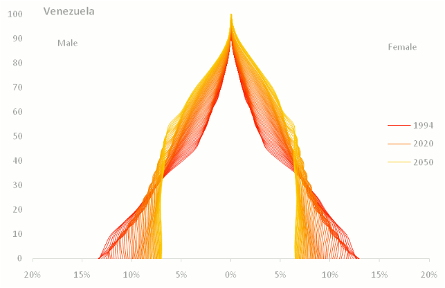
Jorge Camoes came up with this strange idea of an alternative way of representing population pyramids. Check it up!
[image credit: Jorge Camoes] (via Information Aesthetics)
I have tried something "similar". But it's not looking that good...
This chart shows the evolution of the population pyramid (Brazilian male engineers) from 2000 to 2020. Darker lines represent the earlier projection years*.

*That's the aging (and dying) process isolated. In a future post, I'll present the projection results including the trends in the number of graduated students every year.